I Built My First Framer Template. Here's Everything Nobody Tells You
The full journey of my first Framer template, from the first idea to Marketplace review, launch and v1.1.

Quick answer
Building a Framer template is closer to shipping a product than designing a website. What Callback taught me: build editable sections as components with props, test at in-between screen widths, make everything that looks clickable work, ask someone else to click through before you submit, and plan v1.1 before you ship v1.
Key takeaways
- Build everything editable as components with props from day one.
- Test at in-between screen widths, not just the three breakpoints.
- If it looks clickable, make it work.
- Treat the first release as v1, not the final version.
I recently published my first template on the Framer Marketplace. It's called Callback, a free portfolio template for product designers.
I've designed products for more than seven years: fintech apps, field service tools, enterprise dashboards. I assumed a template would be a weekend project. It turned into a crash course in planning, building for strangers, getting reviewed, launching and updating a real product.
Here's the whole journey, from the first idea to v1.1, including the basic UX mistake I made in my own product.
Why I built a template at all
I've built plenty of websites in Framer, mostly for myself and for clients. Making a template felt like the natural next step. Take what I know about how product designers get hired and turn it into something other designers can use.
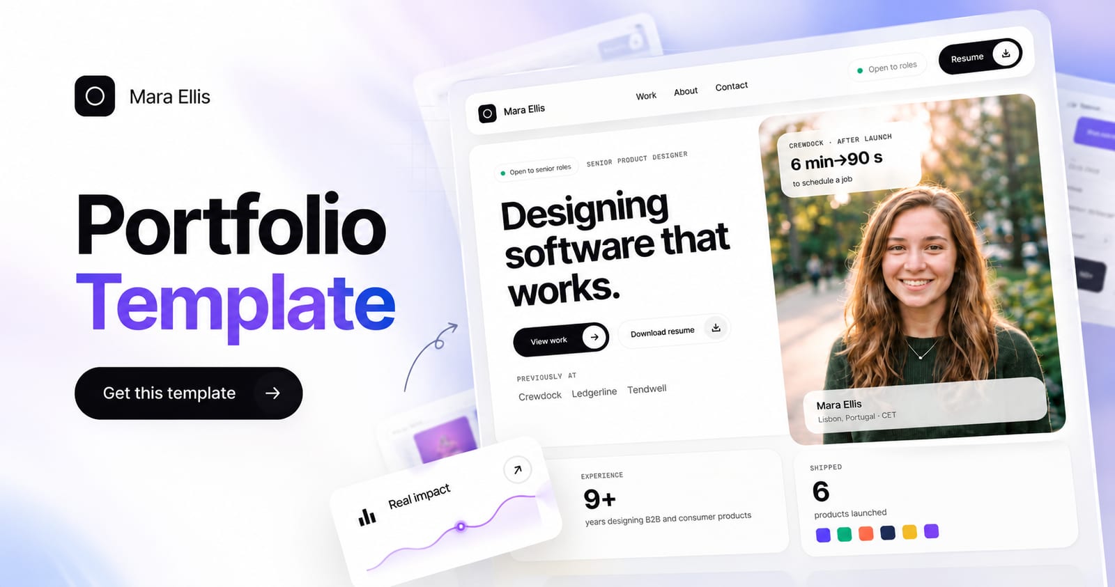
The idea behind Callback was simple. Most portfolio templates I tried were built to look impressive. But when I've reviewed portfolios, I wasn't looking for big visuals. I wanted to see the problem, the designer's role and what changed after launch, fast.
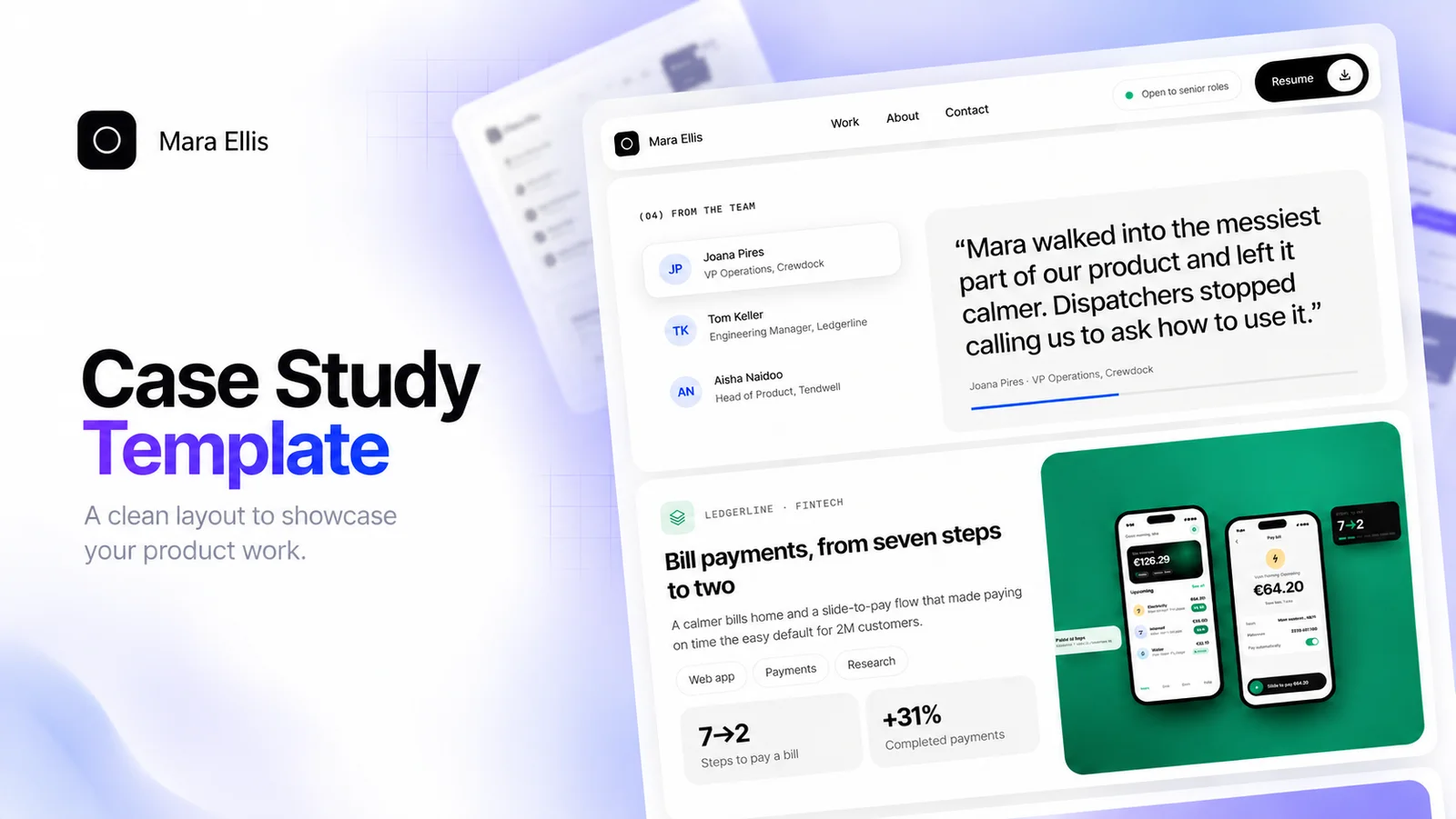
So Callback puts case studies first: a headline result, a few real numbers, a short problem statement and the process in four clear steps. I thought it would take a weekend. It didn't.
Planning: one page for every question a hiring manager asks
Before opening Framer, I listed what a hiring manager wants from a product designer's portfolio. Then I turned each need into a page.
- Home: who you are, a few key numbers and your best work up front.
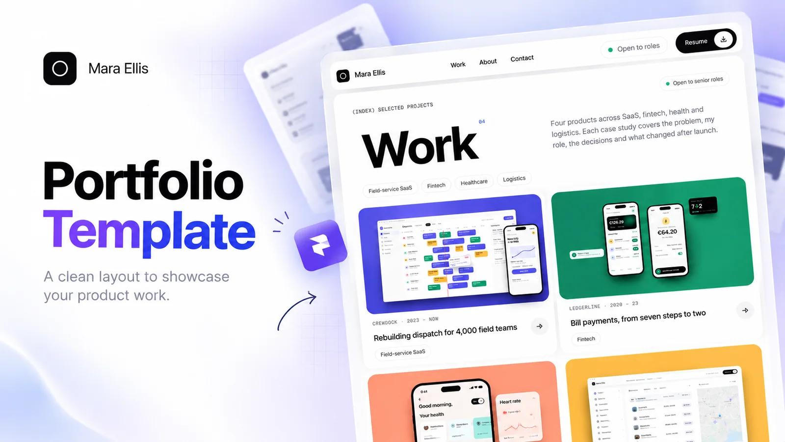
- Work: every project in one place.
- Case studies: the problem, your role, the results and the process.
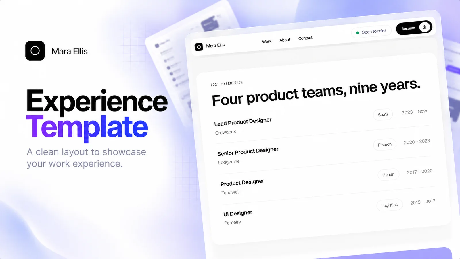
- About and Resume: your experience in a format people can scan. I added a full resume page because a PDF attachment often never gets opened.
- Contact: a form that actually sends.
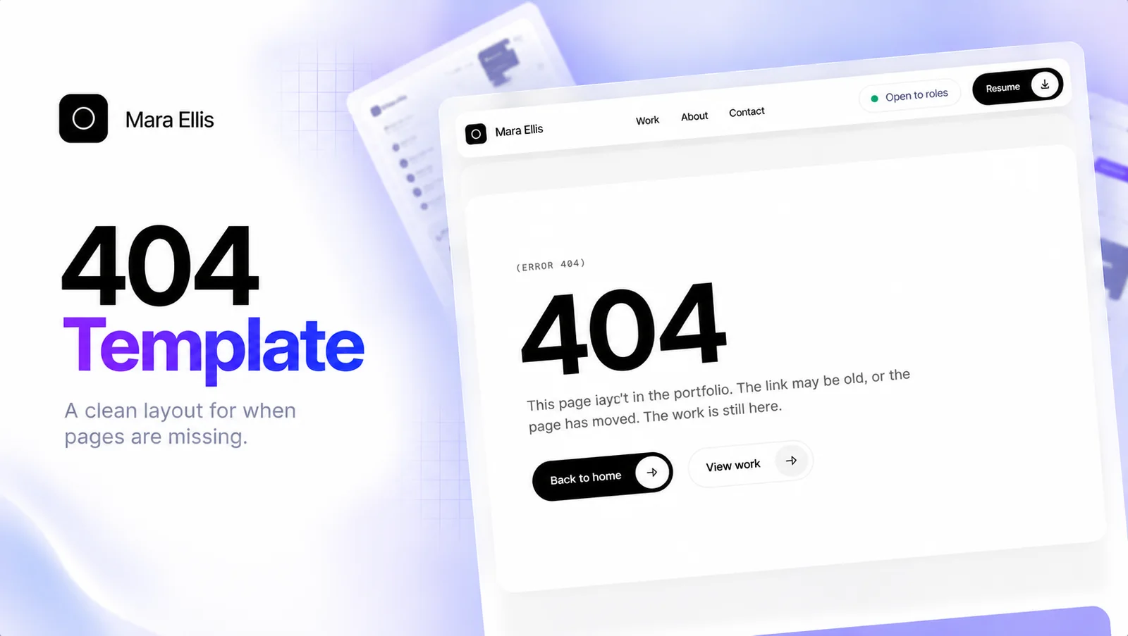
- The pages people forget: a Licensing page, a custom 404 and a thank-you page after the form.
That came to nine pages at launch, each designed for desktop, tablet and phone.
Content: making it feel real
A template full of lorem ipsum doesn't sell the idea. People need to picture their own work inside it.
So I invented a designer, Mara Ellis, and four fictional companies: Crewdock (field service SaaS), Ledgerline (fintech), Tendwell (healthcare) and Parcelry (logistics). Each one got a believable problem and believable results, so the work reads like a real portfolio.
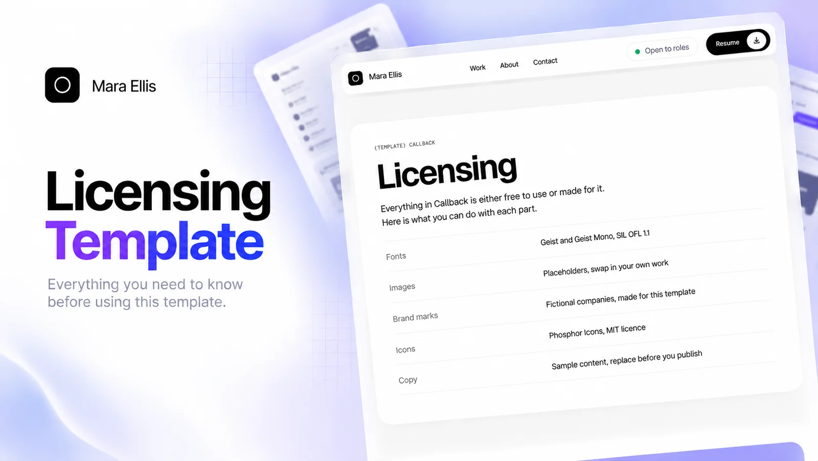
For visuals I used AI-generated placeholder images, Inter Display for type and Phosphor icons. I listed every asset and its licence on the Licensing page, so nobody has to wonder what they're allowed to keep.
Building: designing for strangers is a different job
When I build a site for myself, I know where everything lives. I know which layer to click and which frame holds what.
A template is used by someone who has never seen my layers panel. They want to change a title, swap an image and move on. If editing one line breaks the layout, they'll close the tab.
So I rebuilt most sections as components with clear props: title, description, image, link, a few metrics. Now someone can update a project card from the right panel without touching the structure underneath. That took longer than designing the pages themselves. It's also the part I'm proudest of, because nobody sees it until they need it.
Testing: responsive isn't done until someone else checks it
I tested desktop, tablet and phone. Everything looked fine, so I submitted it.
The Framer review came back with layout issues at sizes I hadn't checked. Not the three breakpoints, but the widths in between, where real screens actually live.
Now I check every update at 320, 390, 768, 1024 and 1440 pixels. I also check one simple thing on each page: does anything make the page scroll sideways? If it does, it's broken, no matter how good it looks at my own screen size.
Review: the card that didn't click
Submitting to the Marketplace means preparing listing images, a description and a live preview, then waiting for Framer's team to review it. Their feedback was specific and useful, and one note stuck with me.
My Work page had four project cards. Only the first one opened a full case study. In my head, the other three were placeholders. In a visitor's head, they were broken buttons.
The Framer team put it simply: make all the cards work, or make it clear which ones are interactive.
They were right, and it's the kind of thing I'd flag in anyone else's product within a minute. When you're close to your own work, you see what you meant to build, not what's actually on the screen.
I didn't hide the cards. I wrote a short case study for every project, linked every card, and added a clear "Read case study" link to each one. I also linked each case study to the next, so readers can move through the whole portfolio instead of hitting a dead end.
Polishing: small details decide whether it feels finished
A subtle shadow on the cards. Consistent spacing between sections. A proper title and description on every page for search. None of these show up in a feature list.
But they're the difference between a template that feels finished and one that feels almost done. People notice "almost done" even when they can't say why.
The listing images got the same treatment. They're the first thing people see in the Marketplace, long before they open the preview, so I redid them to show the real pages clearly.
Launching: sharing without spamming
Going live on the Marketplace doesn't bring visitors by itself. So I started sharing Callback in places designers already hang out: X, LinkedIn, Reddit, Quora, Discord and the Framer community.
I tried to write about what I learned rather than just announce a product. Every community has its own rules about links, so I read them first and kept to one link per post. The most valuable thing sharing brought back was feedback.
Updating: shipping is the start, not the finish
After launch, I kept working on it. I updated the listing images, fixed what the review found, added the missing case studies and started a changelog on the Licensing page.
A template is a product. It has users, it gets feedback and it needs updates. Treating the first release as v1 rather than the final version made it much better.
Should you build one?
If you're a designer who already works in Framer, I'd say yes. Even if it never earns a rupee, you'll learn more about your own design habits than from any client project. You stop designing for yourself and start designing for people you'll never meet.
If you haven't tried Framer yet, it's a good place to start. You design visually, publish with one click, and it handles responsive layouts, CMS and hosting for you. You can try Framer here and build your first site on the free plan.
A few things I'd tell myself before starting:
- Build everything editable as components with props from day one.
- Test at in-between screen widths, not just the three breakpoints.
- If it looks clickable, make it work.
- Ask someone else to click through it before you submit.
- Plan for v1.1 before you ship v1.
What I'd do differently
Honestly, not much in the design. The biggest change would be my process: ask for feedback earlier and click through my own work as if I'd never seen it.
The most useful lesson from my first template had nothing to do with Framer. Even after years of design, my own blind spots are the hardest ones to see. Someone else's eyes will find them in minutes.
If you want to see how Callback turned out, the live preview is at callback-portfolio.framer.website. And if you're building your first template, I'd love to hear what surprised you.
Note: the Framer link above is a referral link. If you sign up through it, I may earn a small reward at no extra cost to you.
FAQ
What pages should a product designer portfolio template include?
Home, Work, case studies, About and a resume page people can scan, and a contact form that actually sends. Don't forget a Licensing page, a custom 404 and a thank-you page after the form.
How should you test a Framer template before submitting it?
Check every page at 320, 390, 768, 1024 and 1440 pixels wide, not only the three breakpoints, and make sure nothing makes the page scroll sideways. Then ask someone else to click through it.
What did the Framer Marketplace review flag in Callback?
Only the first of four project cards opened a case study, so the other three looked like broken buttons. The fix was to write a case study for every project, link every card and add a clear "Read case study" link.
About the author
I design and audit SaaS and fintech products, with teams at Vestas, Dhani and EyeOnTask. Published · last updated .
Keep reading
More from the workshop.
Conversion3 min read
Pricing Page Psychology: Why Visitors Leave Your SaaS Pricing Page Without Buying, and How to Reduce Pricing Page Abandonment
Before you discount anything, read this. The problem is usually anxiety, not the number.

Conversion3 min read
The Anatomy of a High-Converting SaaS Landing Page: Clear Hero Headlines, Real Product Screenshots and Social Proof That Actually Works
Read your hero headline out loud. If a stranger can't tell what you sell, nothing below it matters.
Conversion3 min read
SaaS Microcopy That Increases Conversions: Button Text, Password Hints and Error Messages That Remove User Hesitation
If any button in your product says 'Submit', this post is for you.